
A live English-tutoring platform I co-founded, used by students in 30+ countries. Read this for range: zero-to-one, design that ships in code, and a content decision that unblocked the company.
nwmoon is a live English-teaching platform I co-founded. I built this project with one English teacher and a full-stack developer. The idea started from a problem every experienced teacher knows but nobody prices: before a 60-minute paid session, a teacher spends 30 to 90 unpaid minutes getting ready, remembering what the student covered last time, deciding what comes next, choosing which book, pulling the material together. The more experienced they are, the more they still do it, because they don’t want to walk in lost.
Our bet was to remove that prep entirely. A teacher opens a session and the system already knows what was taught last time and what comes next, with the whole roadmap and material ready. No preparation, no guessing which book. That promise is what the rest of the product had to deliver, and it created two hard problems: how to get great content into the system at all, and how to put it in front of students so they actually learned from it. I owned a large part of both.

nwmoon, live at nwmoon.com: built so teachers walk in with zero prep
The Content Bottleneck
Great content turned out to be the easy half. With a master prompt, our teachers could generate an entire course with AI in almost no time. The hard half was getting it into the product. When I joined the project, the plan my co-founder had assumed was manual: open an admin screen and type every lesson in by hand. Generating the material took minutes; entering it by hand would have taken six to nine months. The bottleneck wasn’t creation, it was data entry, and left alone it would have quietly killed the roadmap.
So I reframed it from a UI problem into a data problem. If every piece of material shares one underlying shape, we don’t need a person typing into forms, we need a structure. I designed that shape: a single JSON schema every lesson conforms to, built so the AI-generated content could pour straight into it. Our developer built the content workspace at content.nwmoon.com around it.
Here is the whole idea in one shape. Every lesson, however different, is the same document: an objective, the target language, teacher notes, and four ordered sections, Context, Study, Activation, and Wrap-up. Each section is just a list of components, and each component is nothing more than a type plus its own fields.
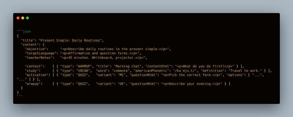
One shape for every lesson: an objective, the target language, teacher notes, and four ordered sections, each a list of typed components
That uniformity is the payoff. Because a VOCAB card, a TABLE, an AUDIO clip, and every QUIZ variant are all just typed objects in one contract, AI-generated content pours straight in with no one typing a single field, and a creator can even paste tagged plain text and have it normalized into this shape automatically. A non-technical content manager uploads the whole set in about a day, and a week of review is all it takes before it goes live.
What would have taken six to nine months of manual data entry now takes about a day to upload, plus a week of review before it ships. That one reframe is what made the entire content engine, and the product itself, possible to scale.
This part had no interface to show off. It was a designer looking at a workflow, seeing that the real problem was the data, and moving it to where it could actually be solved. I designed the shape; the developer built the tool around it. It is the decision I am proudest of on the product side, because it is the one that turned a six-to-nine-month bottleneck into about a week and let everything downstream exist.
The Teacher’s Side
Structured content is only useful if it lands as a teachable session, not a data dump. So the teacher opens a lesson already shaped into an arc: Context, Study, Activation, then Reflection and Wrap-up, with a Time Breakdown that splits the 60 minutes into paced blocks. The objective, target language, and a teacher script sit at the top, and the same components the student will see are mirrored here, with the ones the teacher drives live clearly marked. This is the payoff of the promise from the opening: the teacher walks in and the session is already planned, timed, and ready to run.
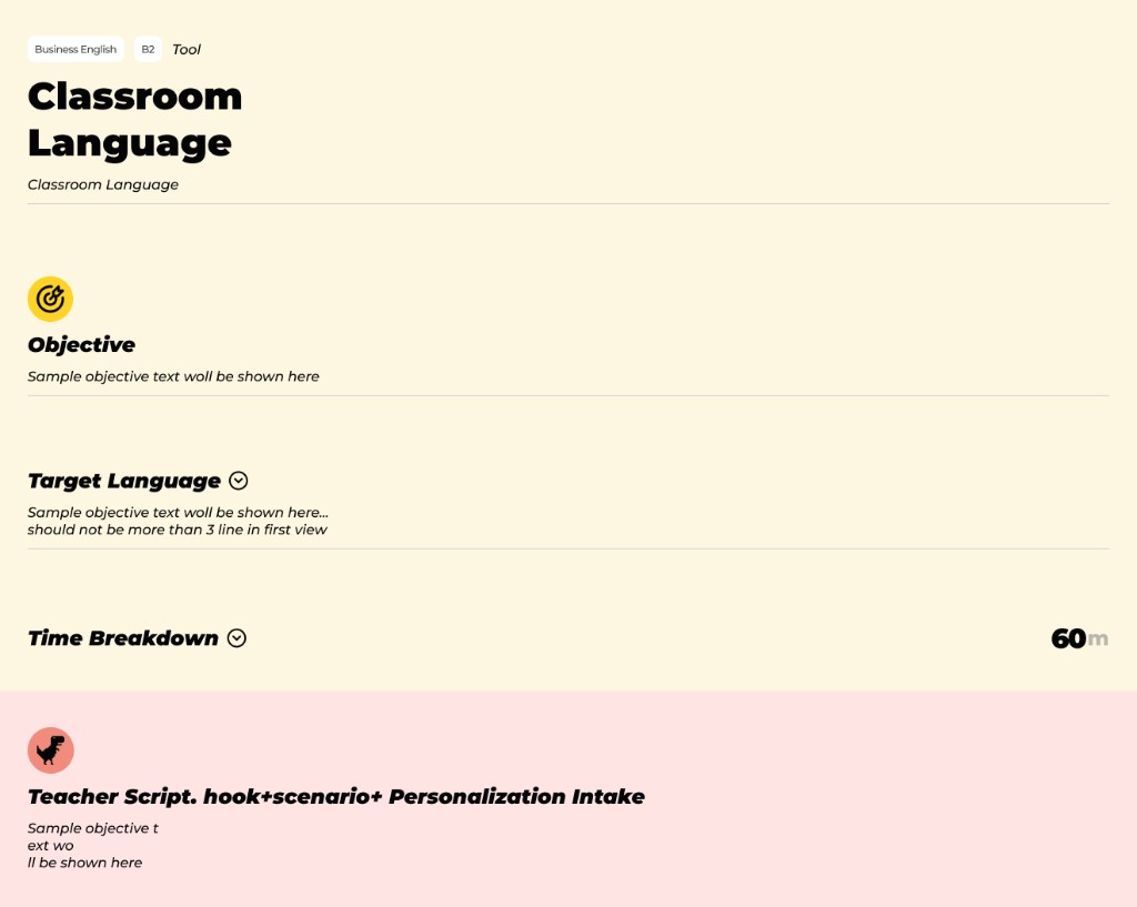
The teacher opens a lesson that is already structured: objective, target language, timing, and script set in advance
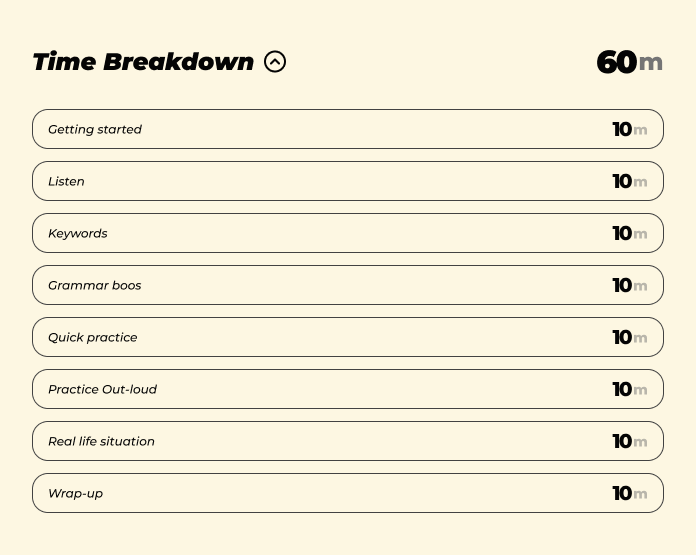
The Time Breakdown paces the session into blocks, so the teacher runs to a plan instead of building one
The MVP, and What Students Didn’t Feel
With content flowing and the teacher’s side taking shape, the next question was how to show it to students. We shipped a fast MVP first, mostly AI-generated UI, and ran real sessions so we could watch teachers and students actually use it.
The split in reactions was the insight. Teachers loved it immediately, but they were biased: it was a tool that saved them work, so of course they were happy, and they couldn’t see its ceiling. Students were the honest signal, and they didn’t get it. To them it was just another way to study, a book or a website, same thing. They hadn’t felt what made it different: unlike a book, the lesson behaves like an interactive app, with exercises and practice built into the flow, while a teacher sits beside them. The closest comparison is studying in something like Duolingo while a real teacher watches over your shoulder.
So I reframed the goal. The job wasn’t to convince students of the value, it was to design the experience so they simply learned better while using it. Value you have to explain is value the design failed to deliver.
Color as Memory
The first MVP used one flat color everywhere. Redesigning it, I built the interface around how attention and memory actually work for learners, not around visual variety for its own sake.
The core decision was a consistent color language tied to the type of activity, so color stops being decoration and becomes meaning. A learner sees the color and already knows what the component is for before reading a word. Orange holds vocabulary and meaning cards. Yellow is for tables and example sets. Blue is always a question or exercise, whether open-ended, multiple choice, fill-in-the-blanks, or matching. Lime marks a voice note. Purple is plain reading text. And a small live indicator sits on the components the teacher controls in real time, so the student always knows when something is being driven from the other side.
That mapping isn’t a coincidence. Each color is simply the component’s type from the schema, made visible: a VOCAB is orange, a TABLE yellow, a QUIZ blue. The exact taxonomy that lets the machine ingest a lesson is the one that helps a student remember it, one shape serving the pipeline and the person at once.
Because the coding stays consistent across every lesson, color becomes a memory hook. When a student tries to recall a word they learned, they can reach for it through the colored component it lived in, and the page itself turns into a retrieval cue. I designed around a few principles deliberately: repetition, low component density so attention isn’t split, and familiarity through consistency, so a given color always means the same thing and the learner can relax into a pattern they recognize. I pushed that thinking hardest toward learning differences such as ADHD and dyslexia, where predictable structure, reduced clutter, and strong visual coding aren’t nice-to-haves but the difference between following a lesson and losing it.
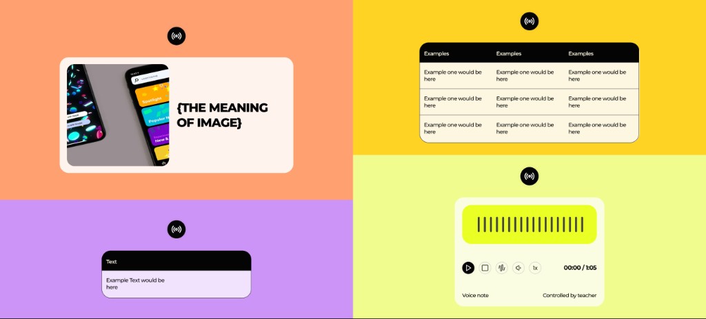
The color system at a glance: orange for vocabulary, yellow for tables, blue for questions, lime for voice notes, purple for reading
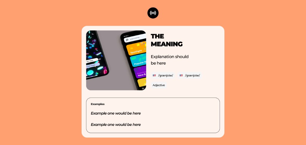
A vocabulary card (orange): meaning, pronunciation, and examples in one consistent layout
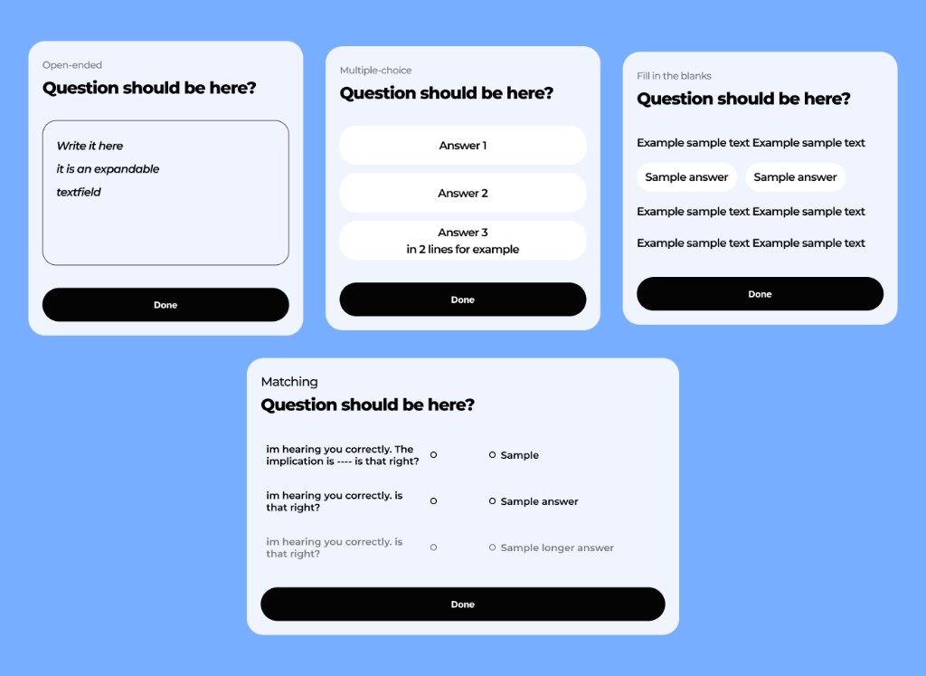
The question family (blue): open-ended, multiple-choice, and fill-in-the-blanks all share one color, so the action is obvious before reading
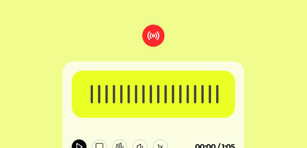
A live, teacher-controlled voice note. The red indicator tells the student when something is being driven from the teacher's side in real time
What I Watched For
I didn’t run a formal study, and I won’t dress this up as one. What I did was watch live sessions while the redesign rolled out, including sessions with students who have ADHD and dyslexia, the learners the color system was most meant to help.
What I saw, consistently, was faster recall and less confusion. Students hesitated less about what a component wanted from them, because the color had already said it, and when they reached back for something from earlier in the lesson they navigated by color instead of re-reading everything. For the ADHD and dyslexic learners specifically, the predictable color-to-action mapping and the reduced clutter visibly cut the friction that usually breaks their focus.
It’s qualitative, observed rather than measured, so I treat it as a strong directional signal, not proof. That distinction matters, and the honest next step is to validate it properly.
What I Built, and With Whom
nwmoon is genuinely a team product. A full-stack developer builds much of the core frontend and backend, and I work alongside him in code, building with Cursor and Claude Code rather than handing off static designs. Several slices are mine end to end: the landing, the user flows, and the live-lesson experience, all designed responsive down to each component. The clearest example is the B2B program, where I designed the experience, built the frontend, and set up the database myself. Designing in code is also why the craft held: there was no translation step between what I designed and what shipped, so nothing degraded on the way to production.
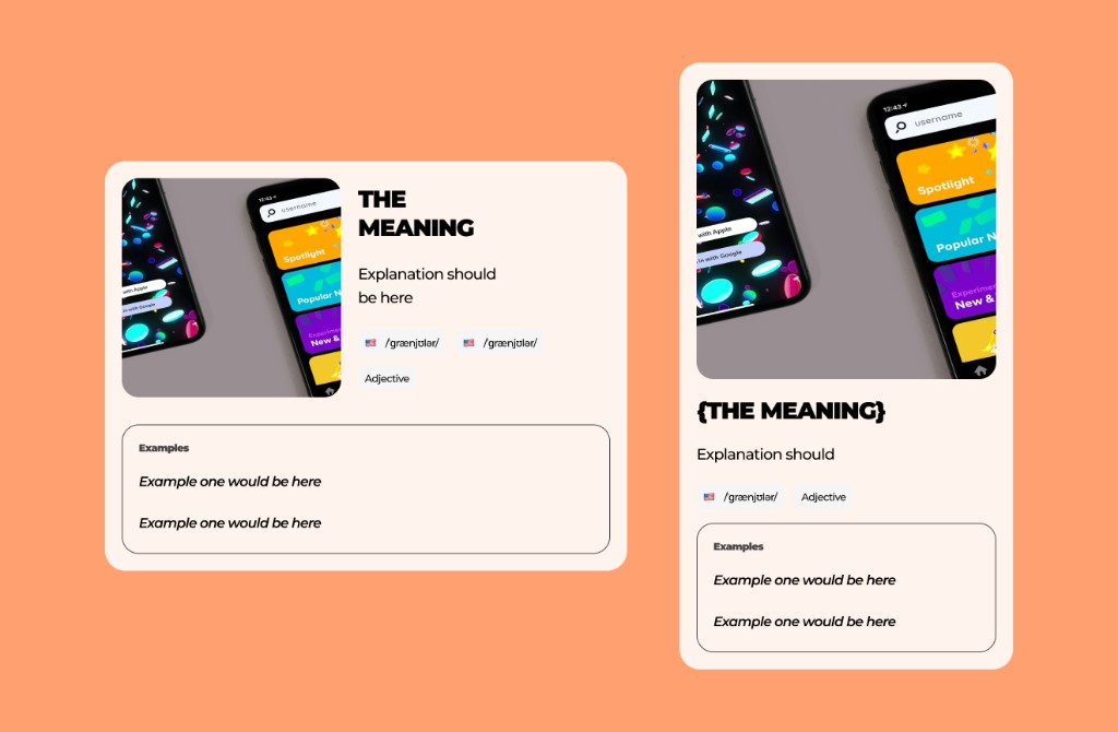
Components were designed and built responsive, because I was working in code rather than handing off mockups
Where It Is Now
nwmoon is live and in active use, with students across 30+ countries, more than 1,000 hours of live sessions every week, and 500+ certified students. It’s early, and those are traction numbers rather than a controlled result, but the core promise holds: teachers walk in without prep, and students learn in a format built for how they actually remember.
What I’d Do Differently
My read on the color system is observational, and I’d make it rigorous. With more time I’d test color-coded lessons against a neutral version and measure recall directly, so the retention claim rests on data rather than on what I watched in sessions. And I’d bring students into the design loop earlier, since they, not the teachers, turned out to be the signal that mattered.