
I added one component to a grocery app’s home screen. Read this for a fast win and how I set up the measurement to trust it.
When I joined Snapp Express conversion was already healthy at around 23%, so squeezing the funnel harder wasn’t where the upside was. The upside was hiding in behavior. Nearly half of our converting users were reordering the same items, and the product gave them no fast path to their usuals. In usability tests the same sentence kept coming up: “I buy the same milk every week, but it takes too long to find.” A behavior that common, served that badly, is a roadmap item.
The bet
The hypothesis was narrow on purpose. If half of conversions are repeat purchases, surfacing those items near the top of the catalog should convert faster and lift total orders instead of just shuffling where they come from. So I defined the success metric before designing anything, and it wasn’t taps on the carousel or share of entry, which any new module wins by default. It was incremental conversion against a holdout, because a new entry point can quietly cannibalize Search, look like a win, and add nothing.
The design was a Previously Purchased carousel placed between our two marketing carousels, the blue one for “OFF” deals and the orange one for promotions. That slot was the real constraint. The page was already loud, so instead of fighting for attention I went the other way. No animation, no extra color, just clean hierarchy so it could be found without shouting.
We shipped it as an A/B test against a 50% control and conversion rose 2.5% over that control, the number that proved it added demand instead of moving it. The supporting signals lined up too. The carousel became the #3 entry point into the catalog after Search and Categories, overtook the OFF-deals carousel beside it, and accounted for 8% of all conversions. Those are corroboration, not the headline. It worked because it respected a behavior people already had, rebuying, instead of asking them to learn a new one.
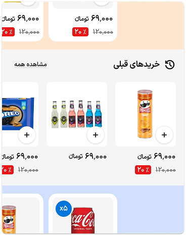
The Previously Purchased carousel, between the blue OFF-deals and orange promotions carousels.
What I did
- Scoped it to one component I could ship in a week, not a redesign
- Defined the win as incremental conversion and instrumented it against a control
- Designed the carousel in 2 days, entirely from our existing design system
- Worked with the PM and developers to ship fast and clean
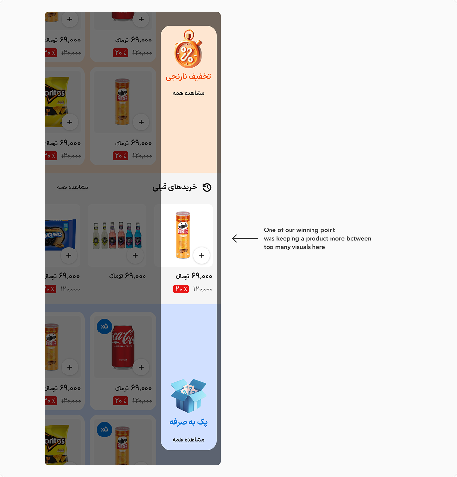
The carousel in context within the home feed.
What I’d do differently
With more time I’d have run variant against variant, not just the carousel against nothing, to find how much further placement and density could push the lift. And I’d have watched the 30-day repeat rate, not only session conversion, to confirm it deepened the habit instead of pulling orders forward.
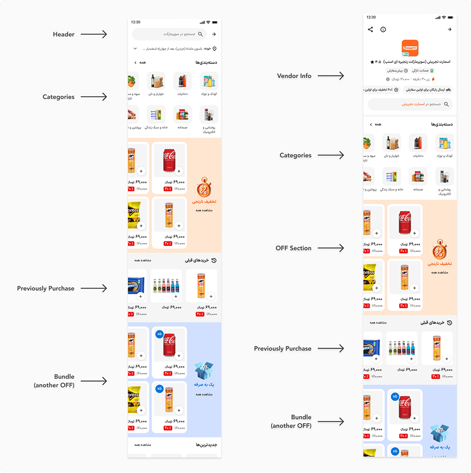
The carousel across the first scroll folds.
Results
- 🚀 Scoped, designed, tested, and shipped in under a week
- 📈 +2.5% conversion lift over the 50% control, the metric that proved added demand
- 🥉 Became the #3 entry point into the catalog, ahead of the OFF-deals carousel beside it
- 🔁 8% of all conversions entered through the carousel (entry share, not lift)